A beautiful, mobile-ready website that looks great at any size? We got this.
Did you know that more people access the internet through a smartphone than a PC?
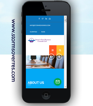 Mobile friendly website design, now most commonly known as responsive web design allows your website to fully and automatically adapt to the screen size you are viewing it on. making it functional on various screen sizes and devices such as Android phones, iPhones or iPad devices. It is also a must for making your site usable for all your visitors,
50% of your visitors now browse the web on mobile devices
Did you also know that 3 out of 5 mobile users immediately exit a ‘non-responsive’ (or mobile ready) website and that around 80% of Ugandan businesses fall into this category?
Webvator Designers can optimise your website to mobile devices and dazzle your mobile visitors with the ultimate browsing experience.
Don’t get left behind – get ahead of your competitors – optimise your website to mobile with responsive design from webvator.
If you are think about a new website design, make sure you build one that is a responsive website design – it can make all the difference!
Let’s first understand the difference. Your current ‘desktop’ website viewed on a smartphone means visitors are pinching, zooming, scrolling or searching for everything, including your contact details. Not a good start, so much so that in a flash, they’ve gone!
Google is now penalizing websites that aren’t “mobile-friendly” or a responsive design, and coupled with the increasing demand of smart devices in the market, there is a growing need for web developers and website designers like myself who offer custom mobile friendly website design services to follow responsive web design guidelines at all times.
A mobile friendly site ensures that both the visitor and website users benefit from its responsive design features. From small startup business to larger corporate website designs, having a mobile friendly websites helps your Google rankings and gives your business a good reputation and usability in front of your customers. This, in turn, ensures your products and services on your web pages reach a wider audience and in combination website seo services it will help rank it higher in Google. Websites that are not using mobile friendly are significantly moved down Google’s search engine rankings when searched through mobile phones, and this is what motivates website designers like me and businesses like you to ensure their website is in the most responsive form possible.

Why do I need a responsive website?
Responsive web design and mobile website design services can be applied to any website or cms framework such as Drupal, Joomla, WordPress and many more.
Responsive design approaches can be applled to e-commerce websites as well with product search, product detail pages, account logins, shopping carts, payment methods, checkouts etc. all being updated to be responsive to ensure the best mobile friendly user experience for your visitors. I am able to work on an existing website to update it with my mobile website development services and all you need to do is contact me for an initial consultation about your requirements
Why mobile? : More people access the Internet through a smartphone that a PC! People lead busy lives these days. The need to access information quickly and on the go is now the norm. If your website is responsive to any type of browser, including smartphones, you can dazzle your visitors by providing the ultimate experience. Just by being able to ‘read’ your content means they will stay longer on your website.
How does it work?: Responsive design websites are built on a fluid flexible grid. The responsive layout re-sizes and re-orientates your desktop website for mobiles of any screen resolution.
Responsive website design – what are the benefits?
Should I switch to mobile?
There really should not be any doubt. You can have a website that caters for all your traffic on any kind of device. Think of it this way, if you can encourage visitors who are browsing your website on a mobile device to stay longer on your website, you increase your chances of forming a relationship with that individual and receiving either a sale lead enquiry.
Immediate benefits of responsive website design include:
Your website is easy to read and navigate
It will work on any smartphone
Responsive websites are built on a fluid flexible grid that adapts to the browser that renders the website.
Mobile ready is eCommerce ready
Responsive website design works with your shopping cart so you won’t lose the sale!
Higher conversion rate of sales and enquiries
Visitors stay longer because they can actually ‘read’ your website meaning more chance of a sale or enquiry.
It’s fast-loading
There’s no Flash or other technologies that are not thoroughly supported by mobile devices
You’re saving time and money
Since you only have to design one website, you save time and money in planning and building separate versions for different devices