If you’re an iPad user like me—especially someone who leans heavily on their iPad Pro for work and productivity—then you’ve probably been eagerly waiting for a real shift in how iPadOS works. Well, I’ve spent over a month using iPadOS 26, and I have to say… this might be the most transformative update Apple has ever delivered to the iPad. But, as with any major leap forward, there are still some bumps that keep the iPad from fully replacing a MacBook for me. So here’s my in-depth breakdown of what I absolutely love, what frustrates me, and where Apple still needs to do better.
The Perfect Middle Ground Between iPhone and Mac
iPadOS 26 finally feels like Apple figured out the identity of the iPad. It’s no longer just a large iPhone or a Mac without the flexibility of a trackpad or mouse. The update brings the best of both worlds into one beautiful, fluid experience.
Using my iPad Pro now feels more like using a MacBook—with a touchscreen. The way windows behave, how apps respond to multitasking gestures, and even how I manage files—all of it feels more desktop-like than ever. It’s finally possible to visualize the iPad as your daily work machine.
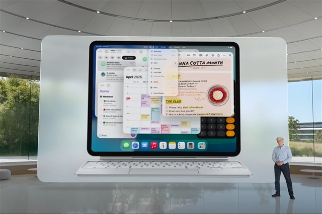
🪟 A Huge Win: The New Windowing System
Let’s start with the biggest highlight: the revamped window management. This is hands down my favorite feature in iPadOS 26.
- You can now open unlimited windows for apps like Safari or Files.
- The red/yellow/green controls (like on macOS) are present and functional—minimize, maximize, and close options are at your fingertips.
- Windows snap easily into place, respond well to touch gestures, and are intuitive to move around with a mouse or finger.
- There’s a new fluidity that wasn’t there before. Switching between apps and arranging your workspace actually feels enjoyable.
However, if you were a fan of the old Slide Over feature, you’re in for a disappointment—it’s gone. Apple seems to have fully replaced it with this new system, and while I don’t miss it, some users definitely will.
🖱️ Improved Third-Party Mouse Support
This is a small touch, but a meaningful one: mouse usability has gotten better. Pointer responsiveness is noticeably smoother, scrolling is more consistent, and drag-and-drop is more precise.
If you’re like me and use a Magic Mouse or any third-party mouse daily, you’ll notice and appreciate these improvements right away.
🧰 The Menu Bar: Almost There
Apple added a Mac-style menu bar, and it’s a fantastic idea—on paper. In real use, it’s a bit of a mixed bag.
✅ Pros:
- Works flawlessly with Apple apps like Safari, Pages, and Files.
- Great for quickly opening new windows, copying/pasting, or accessing app-specific controls.
❌ Cons:
- Falls apart in third-party apps like Outlook or Word—many functions are greyed out or missing entirely.
- Menu bar doesn’t always appear on external displays (especially non-Apple ones like my old HP monitor), which limits its usability in office setups.
I love the idea, but I need it to be more universal, especially for productivity workflows in apps that aren’t made by Apple.
🌐 Browser Frustrations
Using web apps on iPad has always been a bit hit or miss, and iPadOS 26 doesn’t fully fix that.
Still problematic:
- Swipe gestures in web apps like SmartSheet cause unwanted back navigation.
- Buttons in web interfaces (like PowerPoint notes or map controls in D&D Beyond) are often blocked by the system’s gesture rails or toolbars.
- Some websites don’t render correctly in Safari, forcing me to use Microsoft Edge just to get basic functionality.
It’s frustrating when you’re trying to do real work and your browser behaves like it’s on a mobile phone instead of a full computer.
Oh, and don’t even bother with Chrome on iPad. It’s still abysmal.
🌃 Liquid Glass & Translucent UI – Pretty, But Confusing
Apple introduced a new “liquid glass” visual aesthetic, and I’ll admit, it looks sleek. Transition animations between apps are smoother, and there’s a refined feel to the whole UI.
But then there’s the translucent app backgrounds and widgets—and honestly, they’re a usability nightmare.
- It’s hard to distinguish apps and widgets at a glance.
- When everything’s semi-transparent, it becomes a visual mess, especially for apps like Excel and Word where color-coding is critical.
I’d love an option to turn off translucency selectively, just to keep things practical.
💼 Files App & Dock Folders – Truly Useful Additions
Now let’s talk file management—something iPadOS has struggled with historically.
iPadOS 26 finally brings:
- Color-coded folders and symbol-based tagging—fantastic for organizing projects visually.
- Ability to pin folders (like Downloads) directly into the dock, just like on a Mac. That has made my daily workflow significantly faster.
- Improved layout and responsiveness in the Files app.
I do wish we had more than 5-6 color choices, but the ability to add symbols helps fill the gap. This is the most Mac-like Files app we’ve ever had on iPad—and it’s actually functional now!
🔦 Still Missing: True Desktop Power
As much as I love iPadOS 26, it still can’t fully replace a desktop. Here’s why:
- External Display Support is still half-baked.
- The display is capped at 60Hz—a painful downgrade if you’re used to your iPad’s buttery smooth refresh rate.
- Night Shift doesn’t work on external monitors. Why?
- You still can’t share your screen to an external display properly. This is a huge letdown for meetings, presentations, and productivity.
- AppKit is still absent.
- The Mac-like UI on iPad isn’t backed by the same macOS frameworks.
- Developers have to rebuild apps from scratch to support the iPad, which slows progress and limits app availability.
- iPad remains a companion device, not a true Mac replacement.
🤔 A Giant Step in the Right Direction
Despite its flaws, iPadOS 26 is the best update Apple has ever released for the iPad.
It fills the awkward void between iPhone and Mac in a way no previous update has. For the first time, I genuinely feel like I’m using a touchscreen MacBook—just with some training wheels still on.
If you’re considering upgrading, or trying the public beta, I say go for it. The new features will absolutely improve your workflow and user experience. But just know, we’re still not quite at the finish line when it comes to replacing a full Mac for serious work.
🔄 TL;DR – What I Like vs What I Don’t
| 👍 What I Like | 👎 What I Don’t Like |
|---|---|
| New window system (multi-window, easy control) | External display stuck at 60Hz |
| Menu bar for Apple apps | Menu bar missing or broken in third-party apps |
| Better file management (folders, colors, dock) | Mobile browser quirks (buttons, swipes, rendering) |
| Smoother mouse support | Chrome browser is still useless |
| Liquid glass animations | Translucent UI makes apps/widgets hard to identify |
| Mac-like experience overall | Still lacks AppKit; devs have to build iPad-specific versions |
| Faster multitasking and productivity tools | Still not a full Mac replacement—especially for office use |